
Paul Mobbs & MEIR:
‘The Frackogram’
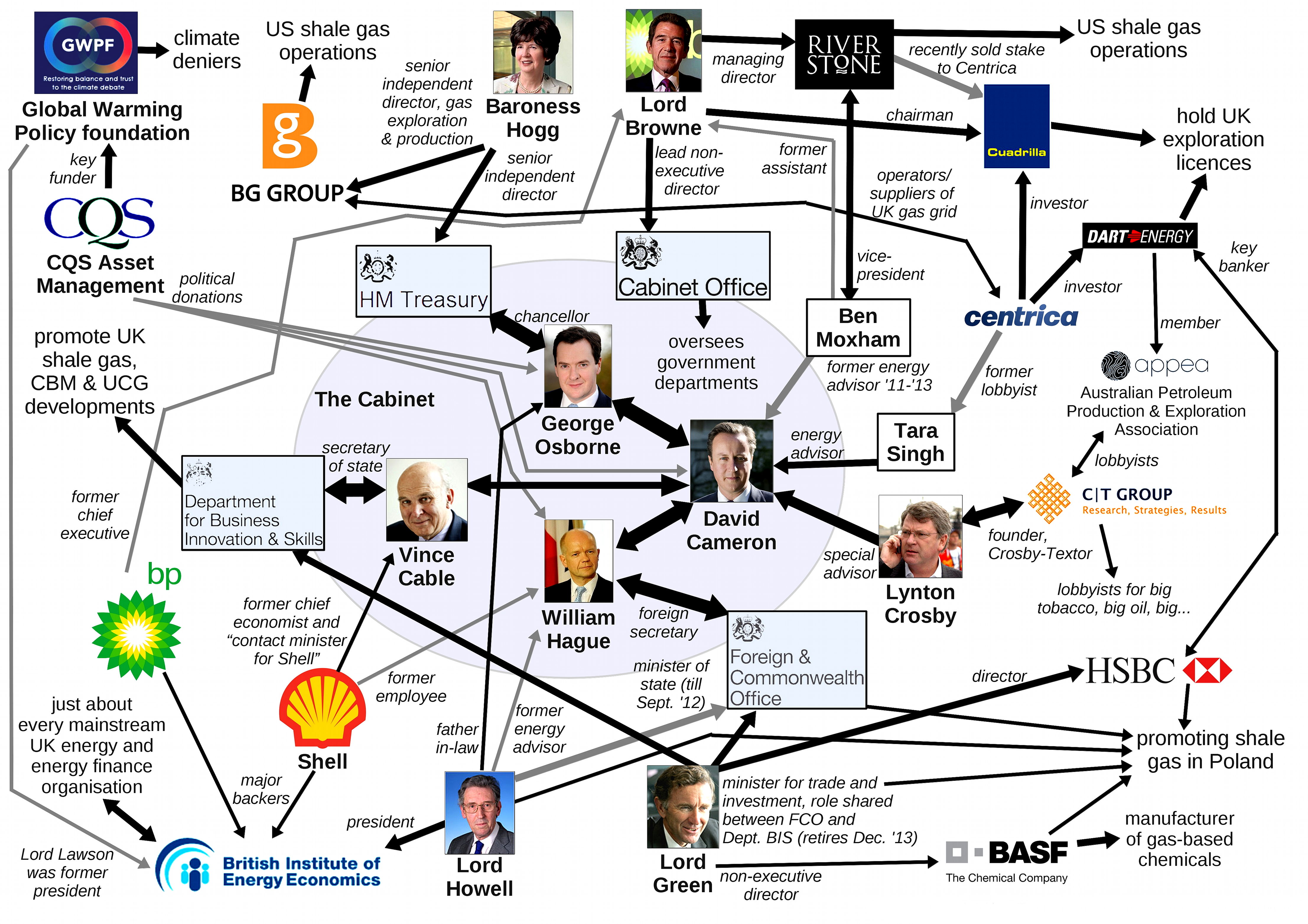
In July 2013 I produced a very rudimentary ‘map’ of the connections related to un/conventional fossil fuels at the heart of Government. After two years of research I produced the final detailed version – The Frackogram; an infographic which depicts the relationships between policy-makers, the oil & gas industry, and the finance and PR industries supporting them.
Introduction to ‘The Frackogram’
This is complicated… no, I mean this is really complicated!
Sorry, but there is no summary available. ‘The Frackogram’ is a representation of a complex set of relationships which, together, create a “web of influence”.
After so long looking at this issue, and all the connections within Government and the industry supporting unconventional gas and oil in Britain, what I see in my head is a three-dimensional data structure which represents a complex network of connections and data which describes them.
The structure of the ‘The Frackogram’ has been likened to a printed circuit-board; and yes, to answer that question, I used to design them as part of my electrical design work. What is important is that this approach allows different types of entity to be grouped together, with a trunk of connections linking the different sectors together.
This page is my attempt to communicate that information in as succinct way as possible. What follows in the rest of the page is a description of how ‘The Frackogram’ was compiled. If you do not wish to wade through that, you can just download the diagram below:
You can download the ‘The Frackogram’ in the following formats:
- A3-size PDF – the smallest practical size to study content the 'frackogram';
- A2-size PDF – the best practical size to study detail the 'frackogram';
- A1-size PDF – the best size for reproduction as a wall poster;
- SVG file – a 'scalable vector graphic' file, allowing you to import and rescale the 'frackogram' to any size without losing quality.
You can print out ‘The Frackogram’ at A4 size, but it is barely legible. To even begin to attempt to study it you need to print it out at A3, preferably in colour, and even then the lines are still a bit tight. For detailed study I recommend you get it printed at A2 size. To get the best effect, as a wall poster, you really need to view it at A1.
The simplest option is to download the files above, put them on a memory stick/card, and then go to your local copy shop and get them printed out in colour at the biggest size you can afford.
First draft, May 2013: ‘The Fracking Organogram’
As the saying goes, “every picture tells a story”, and this one is a bit more complex, and in many ways more bizarre than other comparable tales.
click image to download 1.4 megabyte JPEG version
What that image describes are the connections between the adherents of a mystical belief system (‘economics’) which has become so abstracted from reality that it can no longer represent the truth it was created to describe – and which as a result has actually become harmful to those it was intended to serve.
Back in 2009 when I started looking at unconventional/extreme energy sources, essentially what I was trying to pursue was the data about those sources and what their impacts were. Four years on I discovered that the data was readily available, but generally contradicted the popular media/political storyline of unconventional gas – a generic term comprising three distinct technologies: shale gas; coal-bed methane; and underground coal gasification.
Instead I found myself spending far more of my time trying to chase down who originated one or another egregious statements about these technologies, and progressively less time actually focussing on the engineering or geophysical detail of technologies involved.
For example, take David Cameron's energy advisor within the Prime Minister's office:
From 2011 to May 2013 that was Ben Moxham. Ben Moxham was a former personal assistant to Lord Browne; who was himself installed by David Cameron's Government as “lead non-executive director” at the Cabinet Office – and was subsequently responsible for parachuting large numbers of staff into Government departments from energy companies.
Ben Moxham had been a vice-president at Riverstone, who, with joint venture partner the Carlyle Group, was one of the largest global investors in new and emerging industrial/energy technologies. And it just so happens that Riverstone had bought a large portion of Cuadrilla – the company drilling for shale gas in Lancashire and Sussex – after its parent company got into financial difficulties.
Jump forward to May 2013:
The Growth and Infrastructure Bill having been signed into law, a number of private sector advisors left. After his sudden departure Ben Moxham was replaced with Tara Singh, a former lobbyist with Centrica. Then, less than a month later, it turns out that Centrica is investing in Cuadrilla, buying-out a proportion of Riverstone's holding in the company and funding the roll-out of gas production across Britain. And perhaps as a parallel track in this policy, David Cameron also appointed right-winger Peter Lilley to his advisory panel – renown for his opposition to environmentalists, and who within a week had launched a withering attack on anti-fracking groups in The Spectator (the article is well worth reading – if only for its entertainment value!).
The question therefore arises – in order to be energy and climate advisor to the Prime Minister, it is necessary that your corporate alma mater owns a large stake in Britain's leading fracking outfit?
There is a huge back-story to the diagram above. It's not a “plan”, or a “conspiracy”, it's just business. And as I began to research those connections, and conduct parallel research into the connections within academia and the professional science media, the scale of that diagram grew exponentially.
Final draft, March 2015: ‘The Frackogram’
My decision to study the organisational relationships within Government decision-making, not just the technical issues behind unconventional fossil fuels, began in December 2012. At that point it was clear that the failure of process surrounding Government policy on unconventional fossil fuels were not simply evidential – they were systemic.
There exists no ‘committee for the abuse of power’ within Whitehall.
Instead it is arguable that these abuses are the result of a set of norms which have dynamically evolved form of the lack of accountability of the executive to Parliament and the public – latterly encouraged by the involvement of corporate interests within the processes of Government.
We may deride the overt involvement of corporate finance at the heart of the American system of governance. However, the relatively minor excesses within the British system of governance are worse because we do not have the same checks and balances – defined through the separation of powers – which exist under the American model.
As a result of two years research, I evolved a graphical illustration which sought to represent the complex nature of the relationships at the heart of Government decision-making on unconventional fossil fuels – which, from the above early draft of 2013, was now entitled, The Frackogram.
The structure of the diagram separates different functions within this process:
- Government is at the centre;
- fossil fuel companies are on the right side;
- unconventional fossil fuel companies top left;
- public relations are top right
- finance/consultancy services are bottom right; and, finally
- academia shown bottom left.
Linking these are a complex network of connections, colour-coded according the to purpose of the relationship. Current relationships are shown by solid lines; significant previous relationships are shown with dashed lines. There are also limitations within the use of lines – for example employment, finance and investment are shown in the same orange colour. Arguably the same could have been done for academia or PR because it is based on finance/employment, but different colours are used because the purpose of that relationship is distinct.
The purpose of reviewing the connections between different agencies in this debate is to understand the nature of the environment which defines or constrains those decisions – to explain the context within which recent decisions or policies have been framed. It traces the potential mechanisms by which the public debate over unconventional gas and oil may be manipulated, and how that fits in to the Government's promotion of their policies on unconventional gas and oil.
Within this “map” no one relationship is significant – although in the context of certain questions one may be more significant than others. Instead the purpose of this diagram is to present a picture of the complexity of the pressures guiding current decision-making; illustrating the reality that the present conduct of Government is not the result of a single set of decisions, but rather a dynamic environment within which multitudinous pressures act to refine, confine and influence certain outcomes.